Why is Creating a Studio Setup Harder than It Looks? ... Part 1 Designing for the Camera
Apr 26, 2026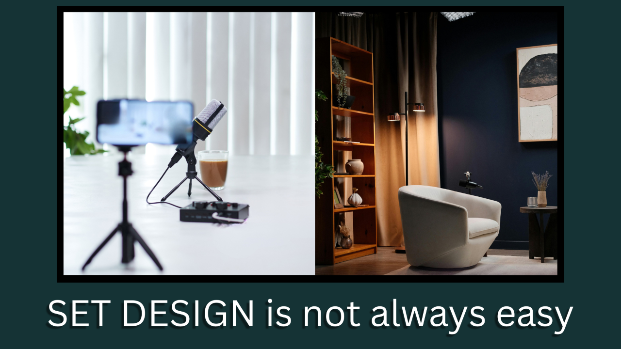
The short answer is…
You are not solving a design problem.
You are solving a communication problem visually.
Grab a drink and get settled in as we dive into this as it is going to be a multi-part answer…
Most people underestimate the complexity of creating a studio set that speaks to who you are and what you are about or offering.
The old adage of… “A picture is worth a 1000 words” is no truer when designing a studio setup for Live Streaming or Podcasting.
The main reason is, you are Designing for the Camera, Not for Reality!!!
Think of it this way… why does a sculpture look so interesting in person but in a photograph it looks plain?
This is the nature of the problem you are working with when designing a studio setup no matter what your niche is.
What looks good in person often looks flat, cluttered, or awkward on camera.
So how do we design a Live Stream/Podcast set with a "Camera First" focus at the common 24 to 50mm focal length lens?
You have to design for perceived depth rather than actual space.
– First things First:
You need to choose to create a “Foreground/Midground/Background” separation, not just physical depth.
Start with a wider shot then you might be used to.
If you do a sit down style stream or podcast, place a desk, mic and mic arm, computer key board, stream deck etc. in, on or around the desk. These are your “Foreground” objects.
– Next is YOU:
Behind the desk and your chair. You are the “Midground” and the focal point of the overall set design.
Make sure you are properly lit using light to separate you from the background.
– Lastly, your Background: Ideally you should have 2 layers consisting of lighting and objects.
The key here is not to overwhelm the foreground and midground with too much stuff or overly bright background lighting, such as a window with bright light coming into it and a white wall behind you.
I, as many do, struggle with this one the most. We feel we have to incorporate so much into the overall image due to our varied backgrounds and experiences that we over do it on the background set dressing.
But there are generally 3 approaches to your background that you should consider…
– The Minimalist:
Pro... Keeps the viewer 100% focused on you.
Con... Can feel templated or soulless which lacks personality/authority.
– The Niche Only:
Pro... High immediate relevance.
Con... Can look like an ad for a company in that niche.
– Personality Based:
Pro... Highest trust, shows that you are a high capacity individual. Can also act as Easter Eggs or Ice Breakers to spark conversation.
Con... Can become distracting/cluttered if not curated correctly.
No matter which approach you use there are some basic recommendations to follow…
– Remember the rule of 3:
This is important when placing objects in the background. Generally, one technical, one personal, one structural.
– Depth is King:
Position your desk 3 to 6 feet away from the back wall background. This helps to avoid the “Webcam” look.
– Color Theory:
Use your brand colors for accent lighting. This will act as a separation layer on the back wall behind any objects in front of the wall.
That was a lot to cover, but it is only the start of set designing for you and your niche.
Part 2 to come soon.
If you are just starting down the Live Streaming/Podcast path, Lets talk and see if I can help you navigate through it all. Click the link below...
Until the next installment...
⬇⬇⬇
Stay Connected with News, Updates and Offers from
Live Stream Consultants LLC
Join the Streaminati Mailing List now.
We hate SPAM. We will never sell your information, for any reason.
