
Why Creating a Studio Setup is Harder Than It Looks? Part 4 ... Sterile or Chaotic Backgrounds
May 09, 2026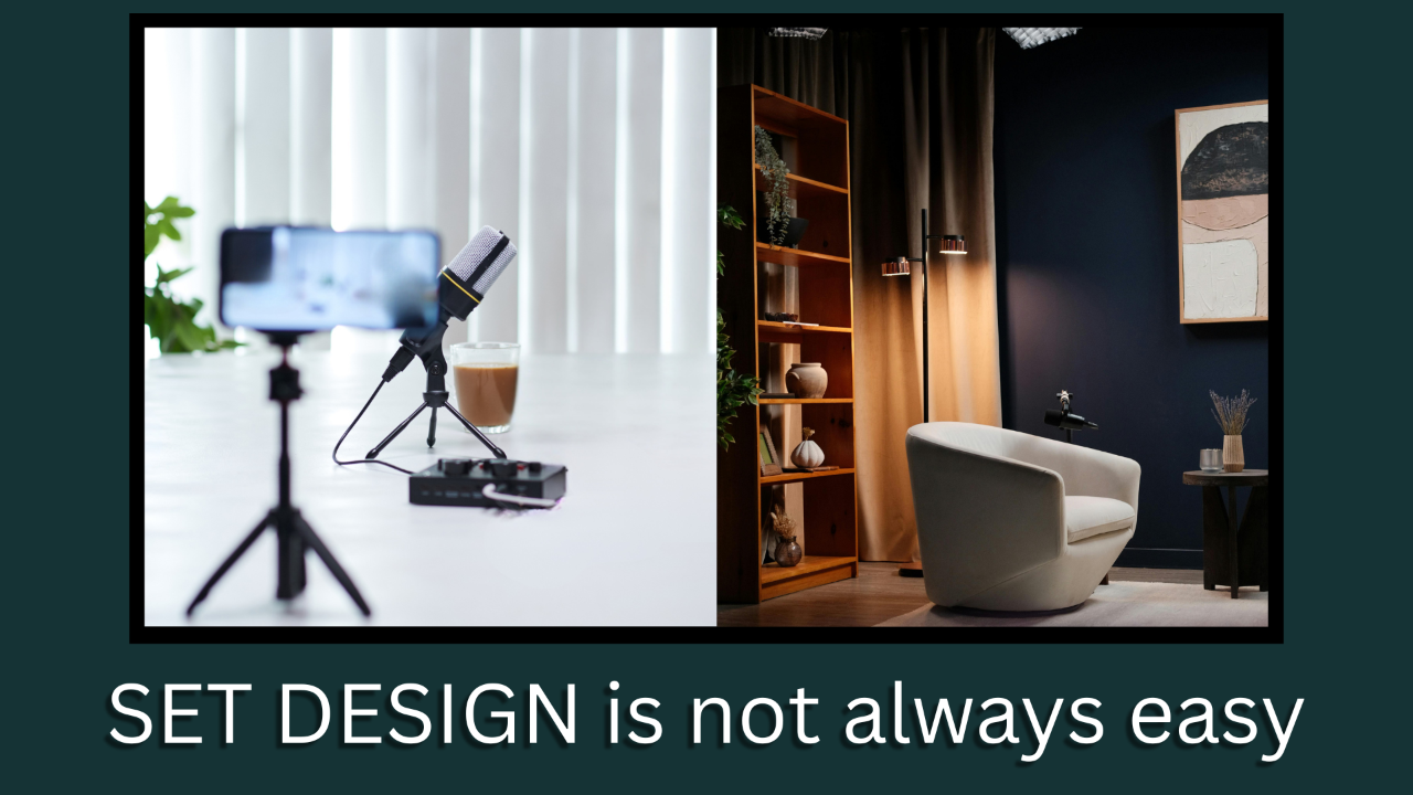
The short answer is…
You are not solving a design problem.
You are solving a communication problem visually.
Finding the middle ground between a “Sterile Corporate” background and a “Chaotic Cluttered” background that communicates “Competence/Authority” and “Personality”, that “Sweet Spot” if you will, can be a challenge.
So often, Live Streamers and Podcasters overcorrect toward either “Sterile” or “Chaotic” backgrounds.
You want enough detail to prove you are a human with a pulse and not AI, but also enough negative space in the background to prove you are a professional with a plan.
This is called “Curated Signal Density”. Everything visible is doing a job; nothing is accidental.
The goal is to simultaneously communicate “Competence and Authority” and “Individuality” without letting either dominate the frame excessively.
Remember YOU are the main subject in the frame.
Here are 4 ways to help you engineer that “Sweet Spot” middle ground…
#1 Limit What Gets To Speak
Most cluttered sets fail because too many elements are trying to communicate at the same time. Sterile sets fail because nothing is there to communicate
Treat your Live Stream/Podcast background like a supporting actor/actress in a big budget movie. Everything they say or do is in support of or to prop up the lead actor/actress which is YOU.
How do you find that sweet spot? One way is, Negative Space.
Now I have to interject a caveat here… There is some debate as to the amount of negative space that is required to do this. It ranges from as little as 30% of the background to as high as 70% of the background.
You will need to experiment with this percentage to suit what looks right for you, your niche and your format. I will tend to err toward the 50%’ish mark as I believe it will, in the end, help to meet that balance between “Competence/Authority” and “Individuality”.
There are a number of ways to do this…
– Generally 3 items per spot... These represent different facets of your identity, personally and professionally (e.g., a vintage camera, aviation headset, camera lens). Do not go overboard here. Use a shelf unit with 2 or 3 shelves and or an end table as part of the practical set dressing.
– 1- 2 secondary texture elements... (e.g. plants, practical lights, wall art etc.).
– Everything else within the set design should be negative space.
You do not want the background to feel as if it is a “collection” on display, but a curated set design that speaks to your target audience.
#2 Anchor Authority First
Most experienced content creators or even business professionals tend to mix Authority and Personality randomly.
This muddies the message your set background is trying to send.
There is a hierarchy to follow in balancing your authority versus personality when layering these two together…
– Layer 1 Authority:
Books, Awards, Certificates, Licenses, Clean Tech, Industry Artifacts (e.g. Cameras, Lenses, Microphones etc.)
– Layer 2 Personality:
Humanizing items such as… Keep Sakes, Mementos, Hobby Items (e.g. Ham Radio, Drones, Full Size Aviation etc.)
The key principle to take away from this is…
Personality should decorate Authority, NOT compete with it.
Here’s a test for your Live Stream/Podcast Set background once you have it set up to your liking…
– Remove the “Personality Layer”, does the set lose credibility? If so, then your set is too dependent on “Personality”
– Remove the “Authority Layer”, is there any change in the credibility? If not, you are just decorating.
#3 Controlled Depth, (Lens Aware Composition)
How we perceive depth in real life is unique to our binocular vision. The subtleties that our eyes are capable of seeing is truly amazing.
But the lens of a camera is not our eyes, it sees only in a flat 2 dimensional plane.
At the common focal lengths of 24-50mm, a phenomenon called “Depth Compression” can turn a few objects on or near your background wall into a “busy wall” if they sit on the same plane.
For reference there are 2 camps as I see it in dealing with this…
– Camp 1, Foreground = You, Midground = Primary Objects, Background = Soft Accents, lighting and textures
– Camp 2, Foreground = Desktop, mic, keyboard etc., Midground = You (Primary Subject), Background = Your Authority/Personality
I personally lean toward Camp 2 so I will speak to “Controlled Depth” in that light.
To work this “Controlled Depth” you must be diligent in placing items in your set design in a controlled manner.
– Staggering distances, not placing everything on one shelf line.
– Let some elements fall slightly out of focus, the use of (Bokeh) is key here.
– Use lighting contrast to guide the viewer's eyes and to highlight what is truly the focus… YOU.
– Your background lighting should not compete with you and your lighting. Adjust the intensity of your background lighting until it just fades into the background… (no pun intended)
All this adds to the layering effect previously mentioned.
#4 Designing for the Camera View Not Your Eye
Never design your background by solely standing in the room with your naked eye.
Once you have your background set up the way you like it, set up your camera with the appropriate lens and set the focal length accordingly. Frame the shot, then set up your lighting and adjust your aperture and ISO to suit.
Now look only through the camera frame, you will notice all the subtle issues with the difference of what your eye sees versus what the camera sees.
Objects that felt important by your eyes often disappear through the camera lens, while small background details may loom large.
This change of viewpoint forces you to curate for the 2D rectangle your audience actually sees, not the 3d space you are standing in.
The first time you follow this set up principle you will be surprised at what pops out and what gets covered up. It surprised me the first time I followed this principle in earnest.
What I thought looked great while standing there in the room with the background all set up and lighted, looked completely off through the camera lens.
I had to rearrange main features, subtract a number of personality items and curate them in a different order to get the look I was aiming for.
It is still an ongoing effort of tweaking it in small ways now, but the difference between what I saw in person versus what the camera saw was dramatic in my case.
When done correctly, a good balance between “Competence/Authority” and “Individuality” through your background can achieve the answers your target viewer is looking for…
– Is this for me?
– Can I trust you?
– Is this worth my time?
Get it right and subconsciously these 3 questions will get answered. Then it is up to you and your content to take your viewer to the next step.
If you are just starting down the Live Streaming/Podcast path,
Let's talk and see if I can help you navigate through it all.
Until the next installment...
⬇⬇⬇
Stay Connected with News, Updates and Offers from
Live Stream Consultants LLC
Join the Streaminati Mailing List now.
We hate SPAM. We will never sell your information, for any reason.
